Trio

context
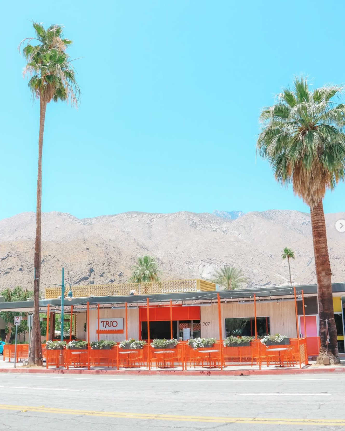
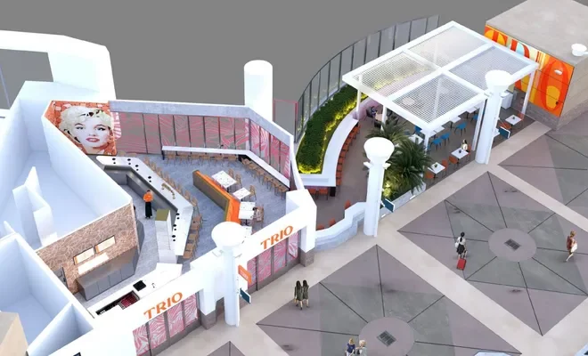
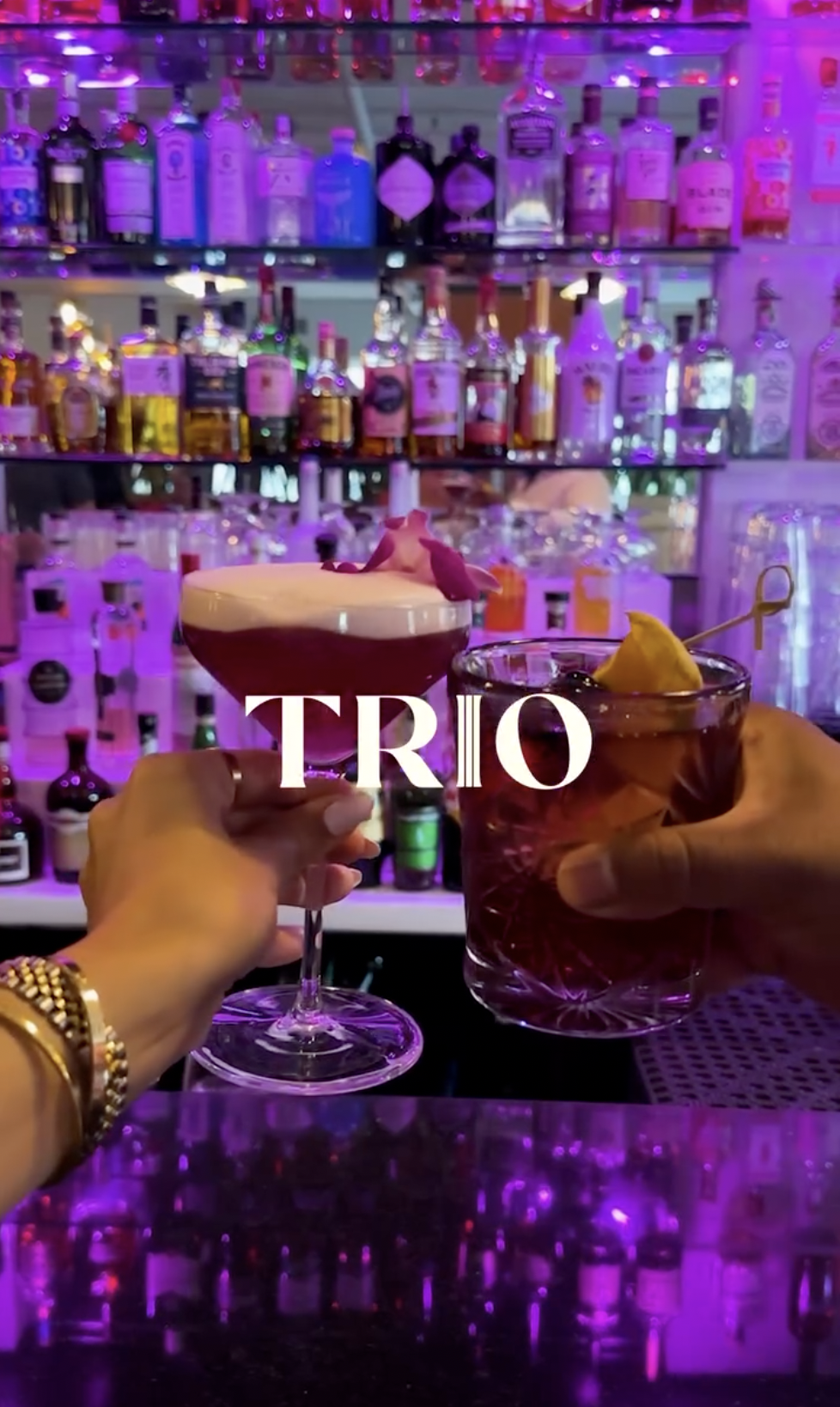
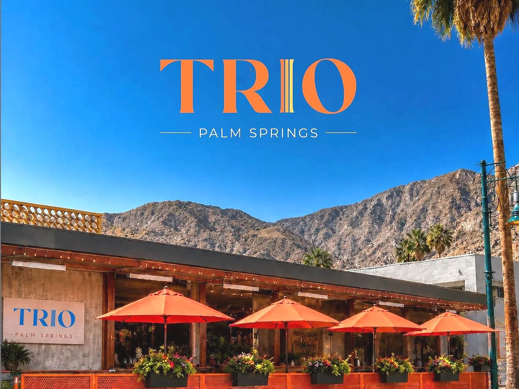
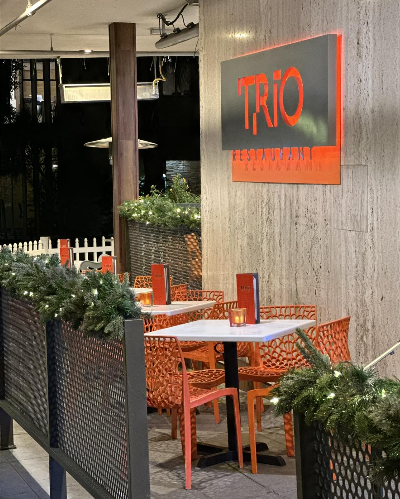
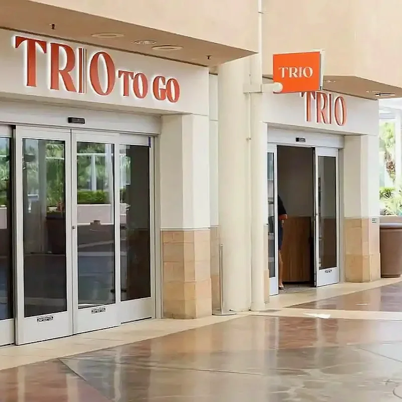
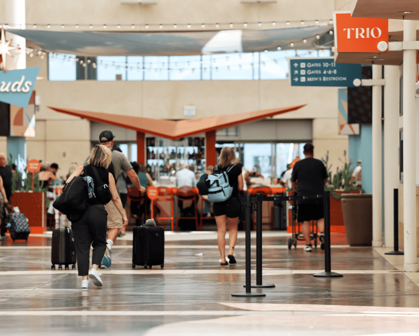
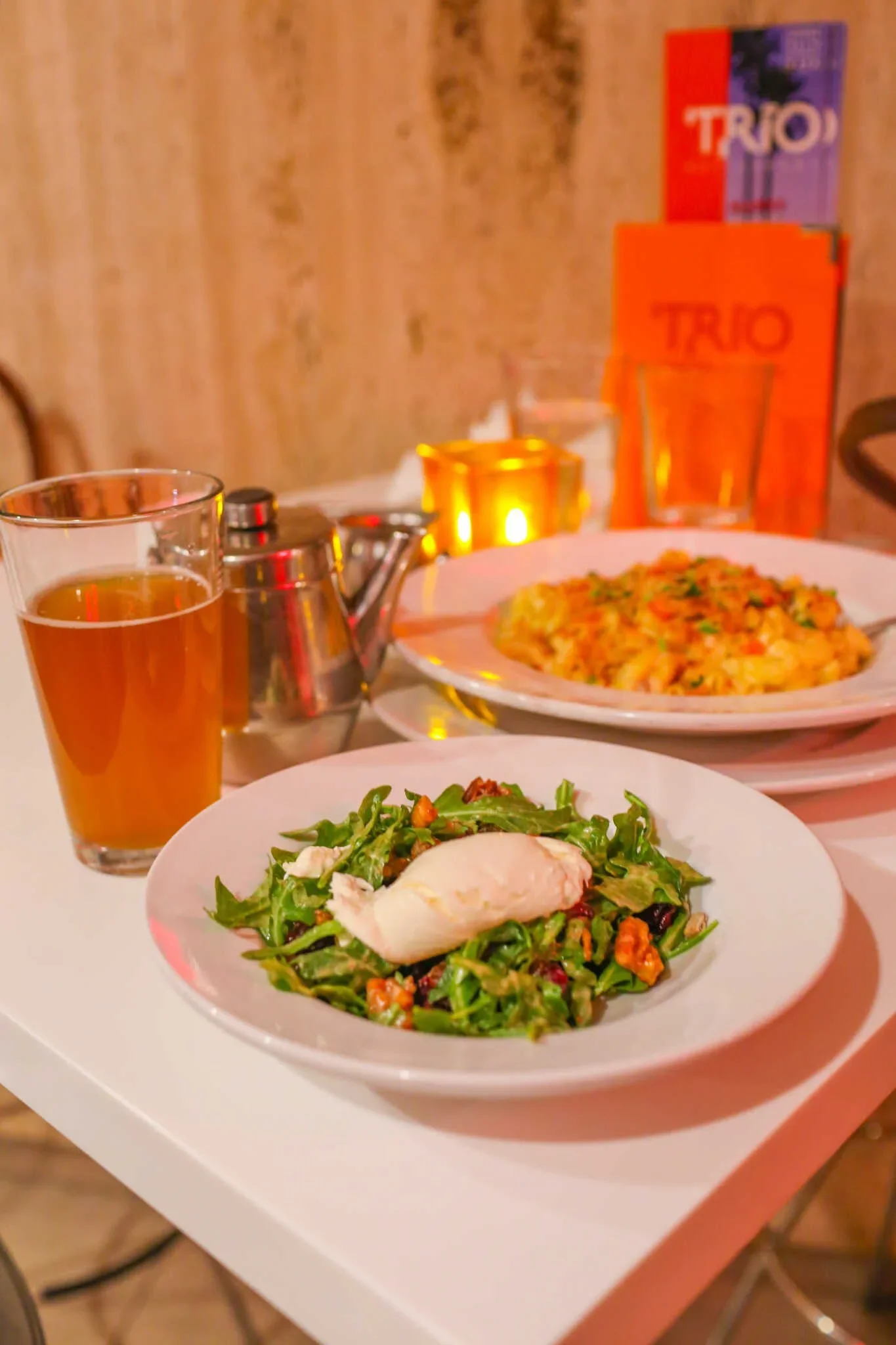
Trio Restaurant is a beloved Palm Springs staple known for its passion for food, art, and music, serving the local community for more than 17 years. As the restaurant prepared to open a new location inside Palm Springs International Airport, they saw an opportunity to refresh their established identity and create a more cohesive brand experience that honored their history while introducing Trio to a new generation of guests.
creative direction | retail & spacial design | photo environmental graphics | merchandising | curation
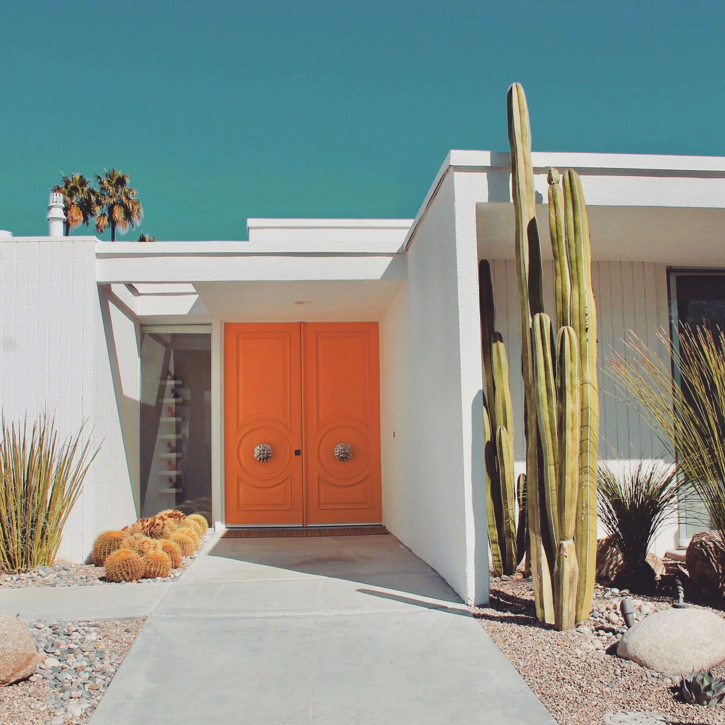
Featured in: Restaurant Week, Food & Wine, Hollywood Times, The Desert Times
the ask
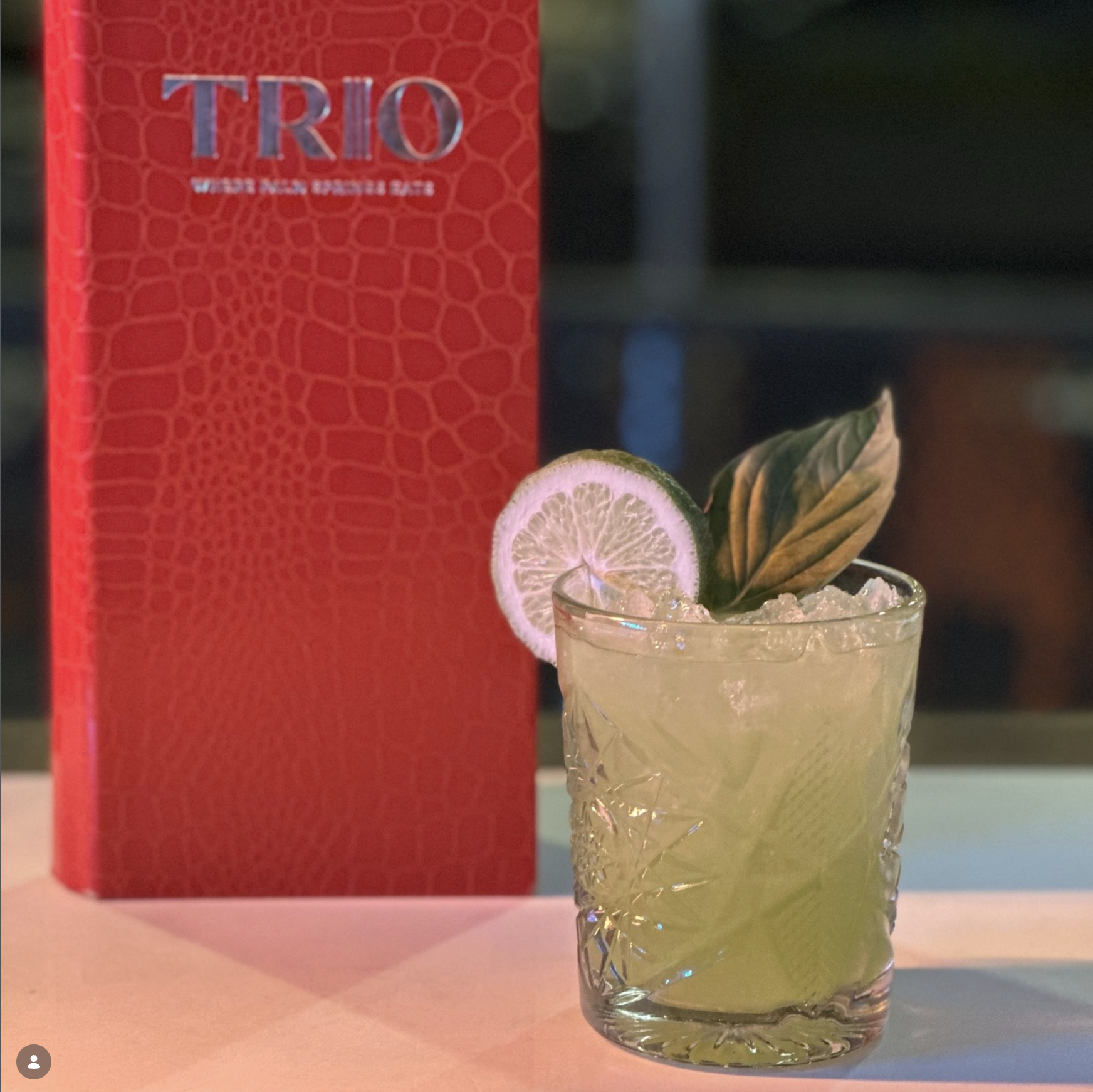
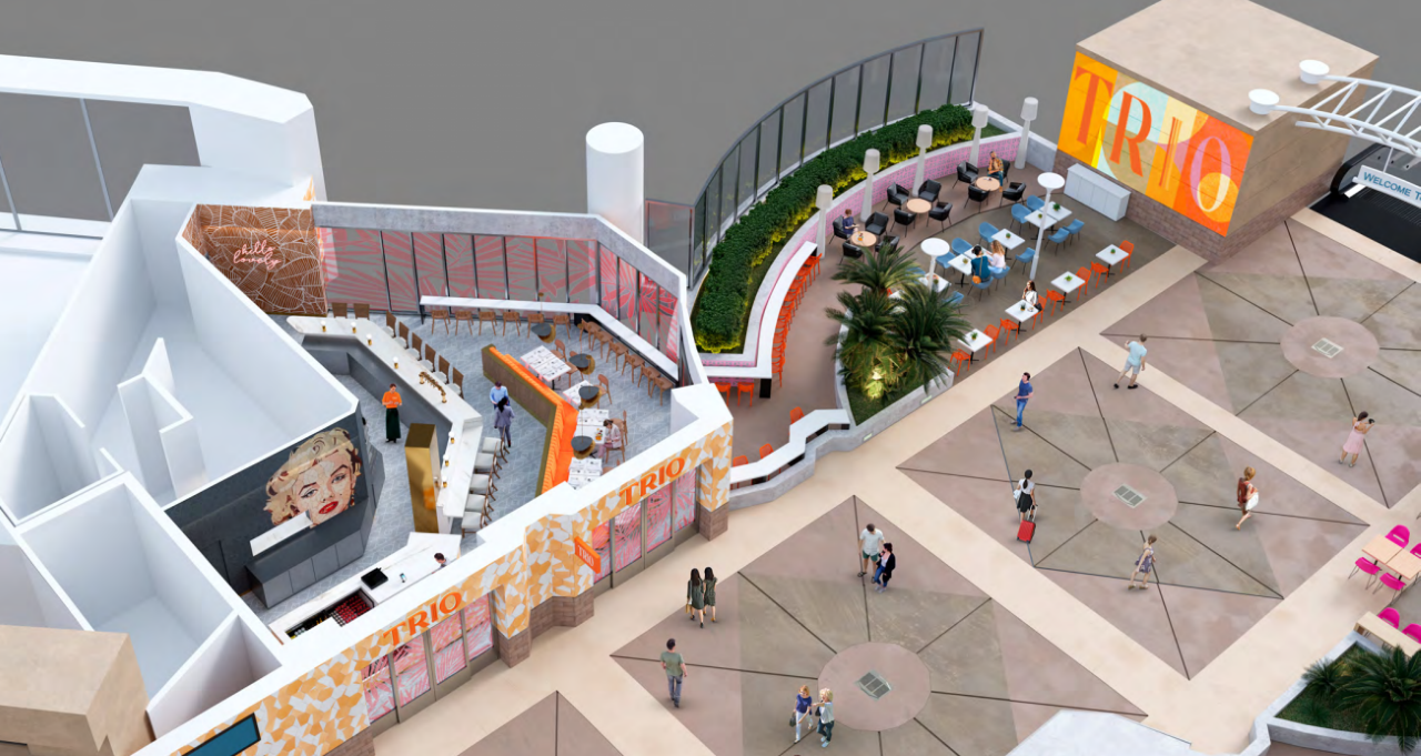
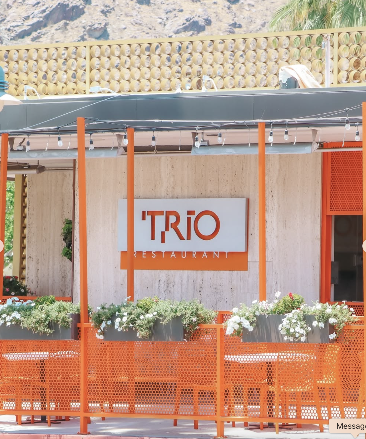
Trio wanted to rebrand without losing the recognition and personality they had built within the Palm Springs area. The challenge was to modernize the brand across both its original brick-and-mortar location and new airport restaurant while finding a visual language that could connect their three core pillars—food, art, and music—and capture the colorful, creative spirit of Palm Springs. The goal wasn’t to reinvent Trio, but to evolve what people already loved about it into something fresher, more ownable, and built for the future.
the solution
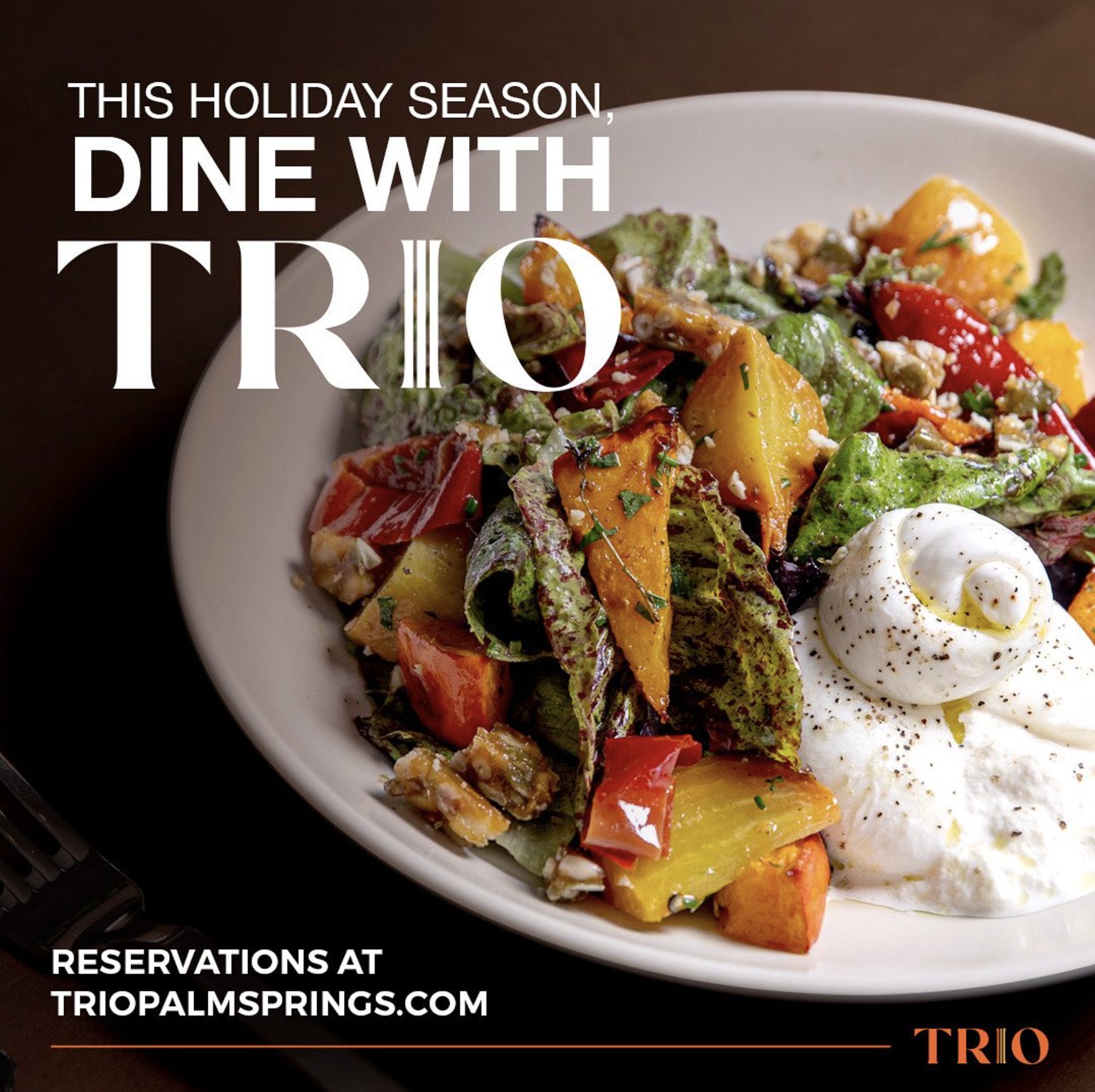
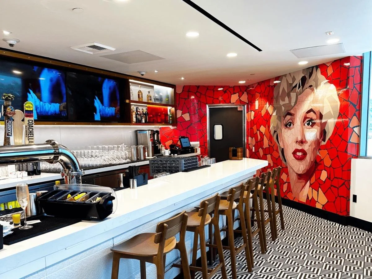
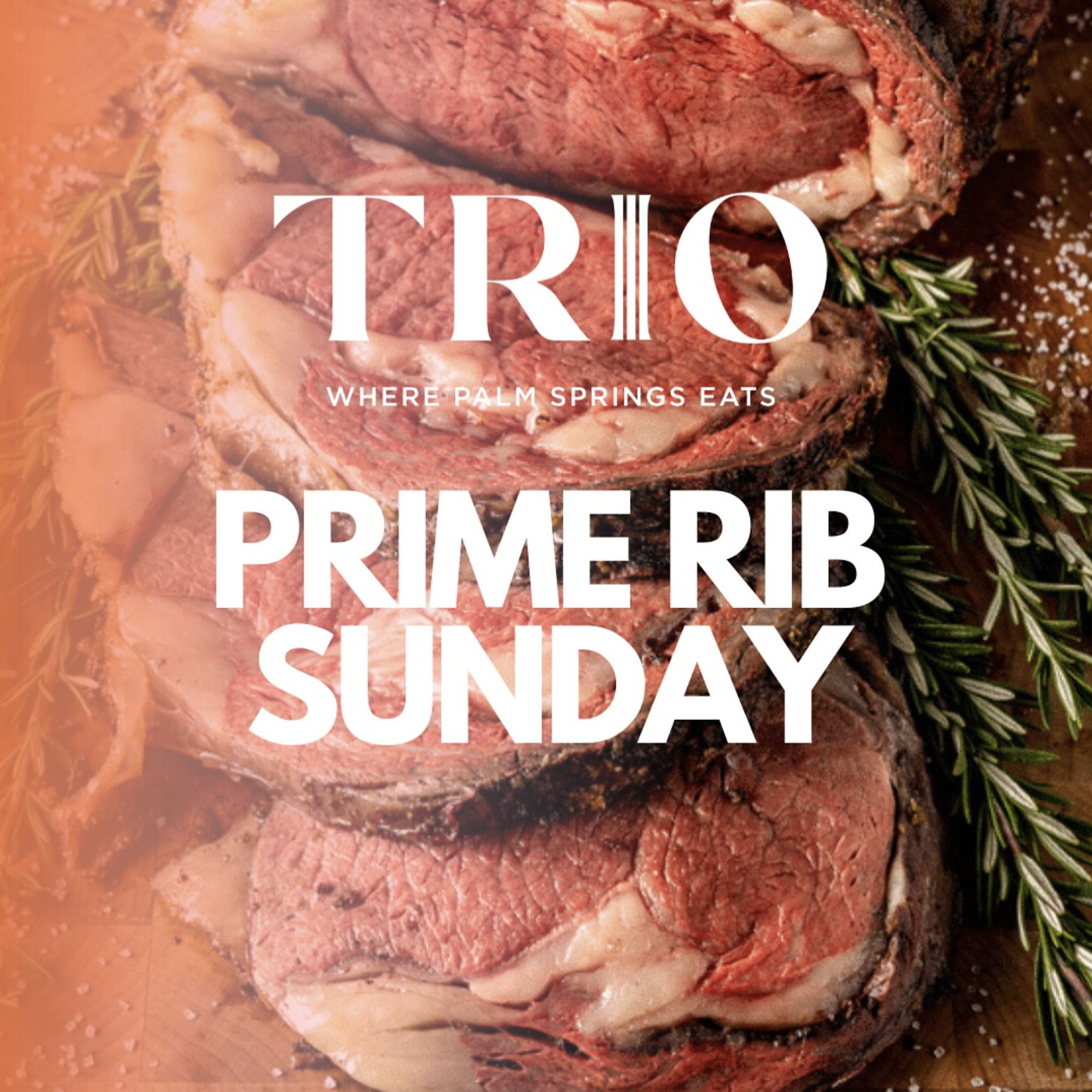
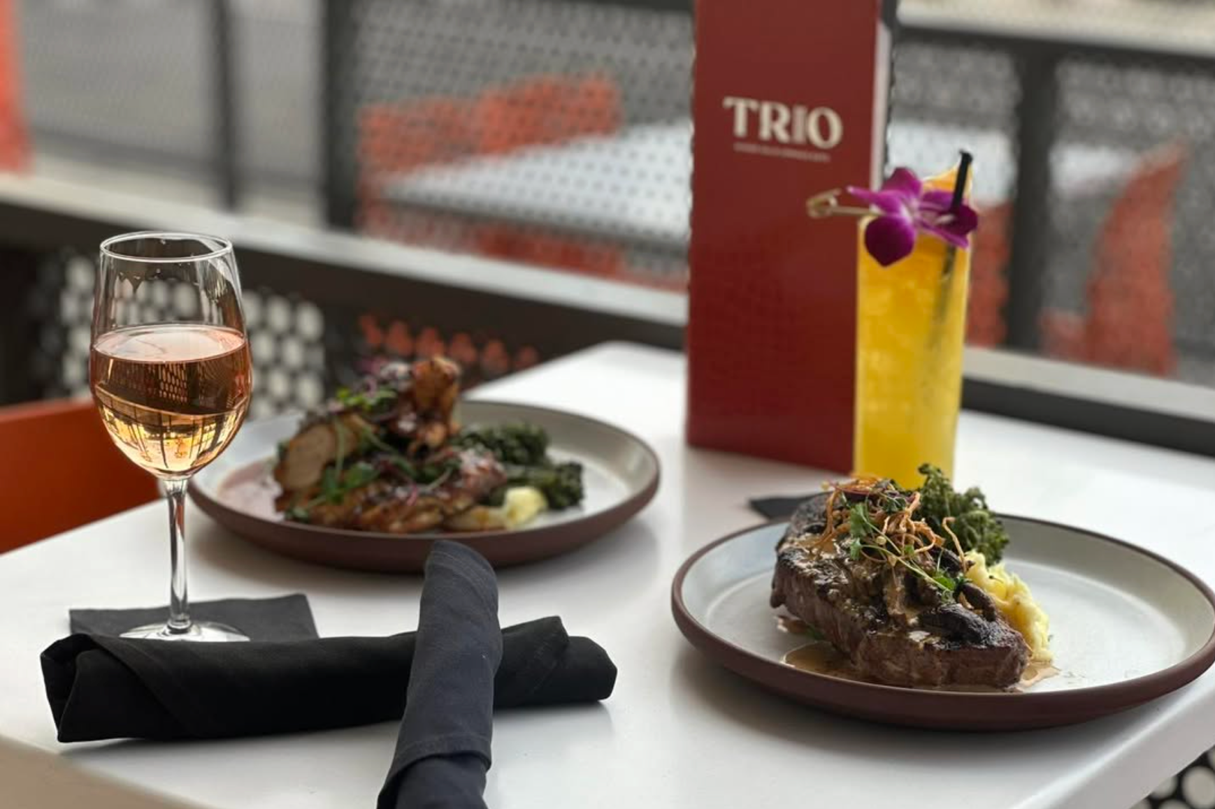
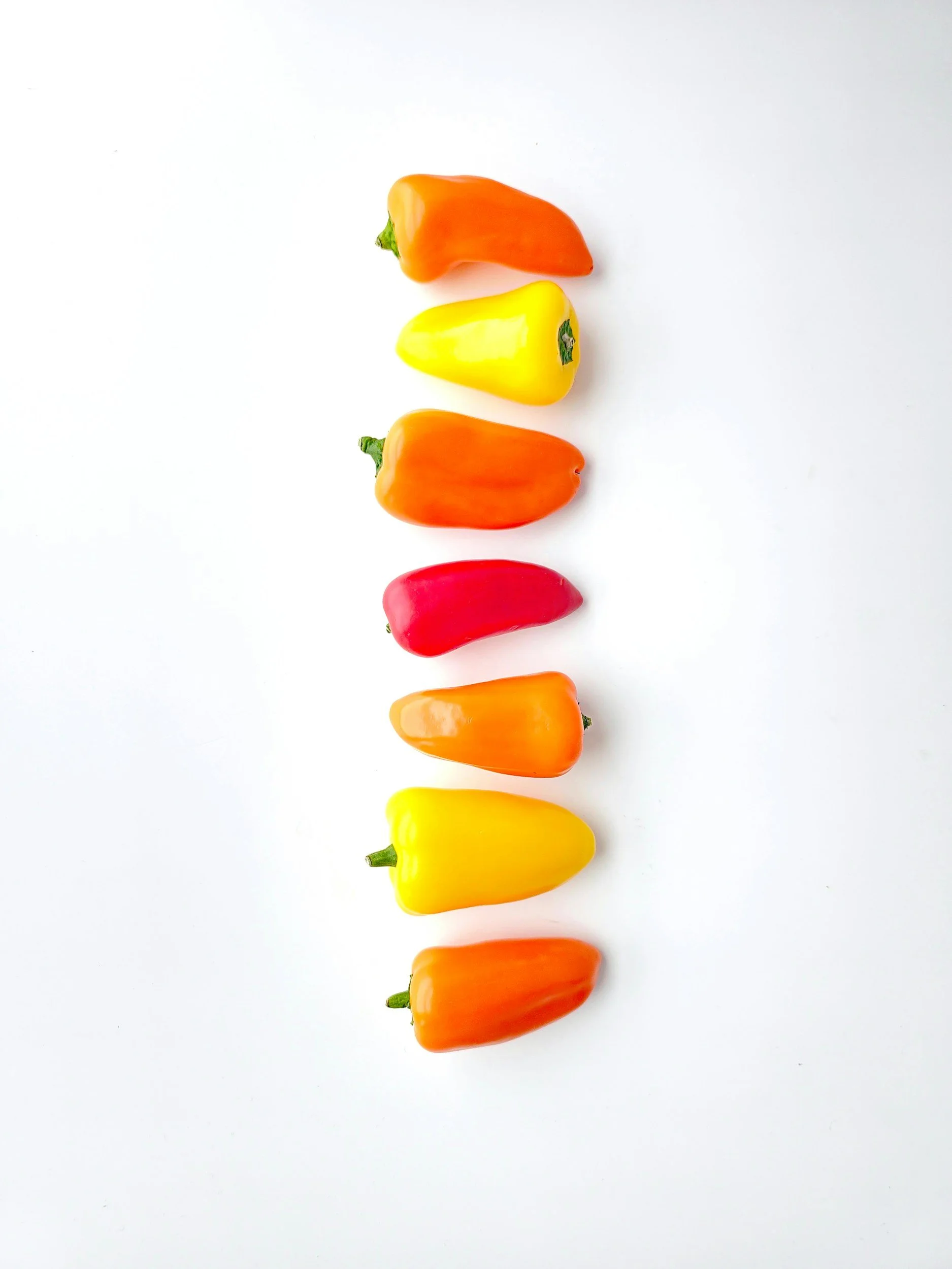
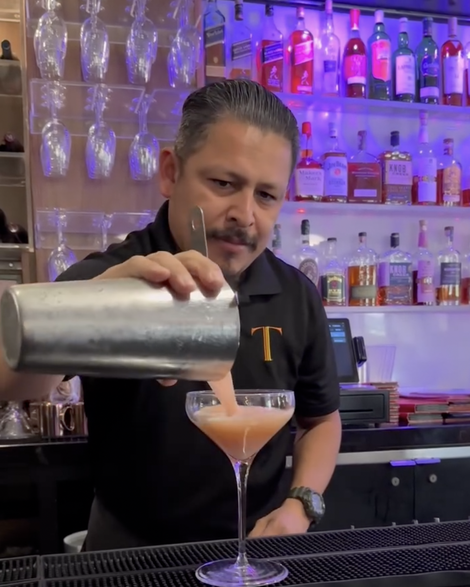
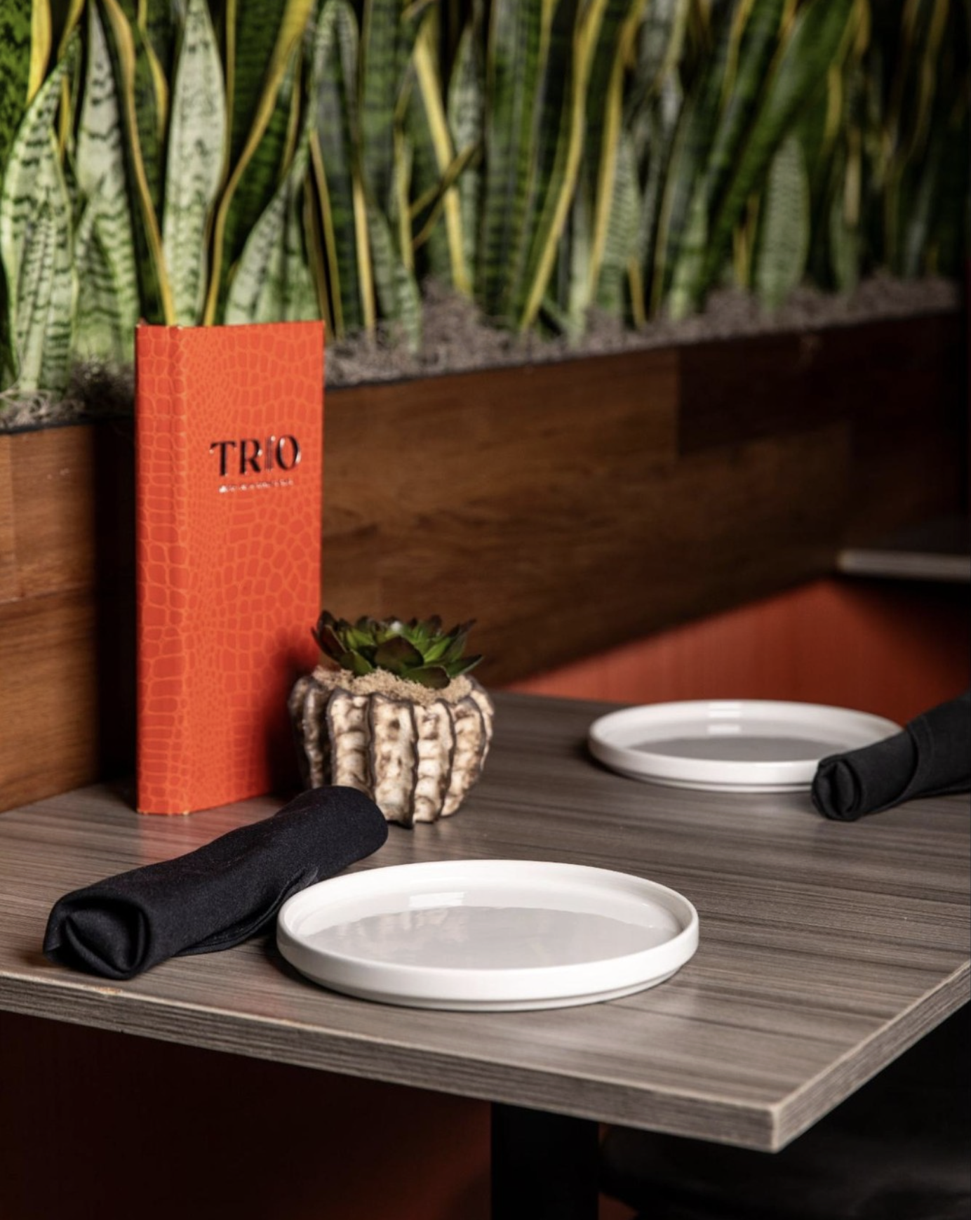
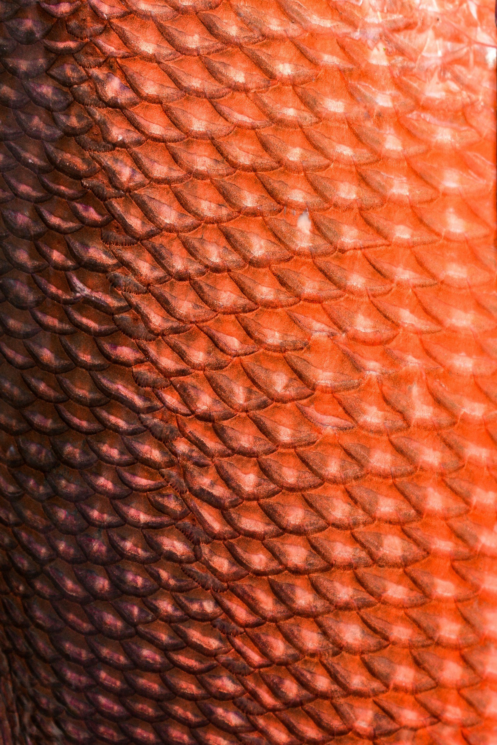
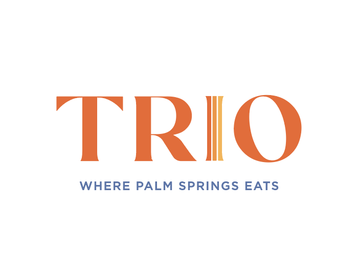
I developed a refreshed visual identity centered around an updated style guide which impacted the logo, color palette, typography, menus, staff apparel, and merchandise, with the logo’s three-column “I” serving as a subtle representation of Trio’s three defining passions: food, art, and music. I retained the brand’s iconic orange while introducing a brighter, more playful palette inspired by Palm Springs’ natural landscape and colorful design culture, then carried the new identity into the physical environment through art direction and aesthetic development for the airport location. I also helped curate artwork, select and direct a muralist, and shape the overall interior aesthetic to ensure the new restaurant felt unmistakably Trio, just refreshed for its new chapter.